Custom Sankey
Government Spending Visualization
Government Spending Sankey Visualization
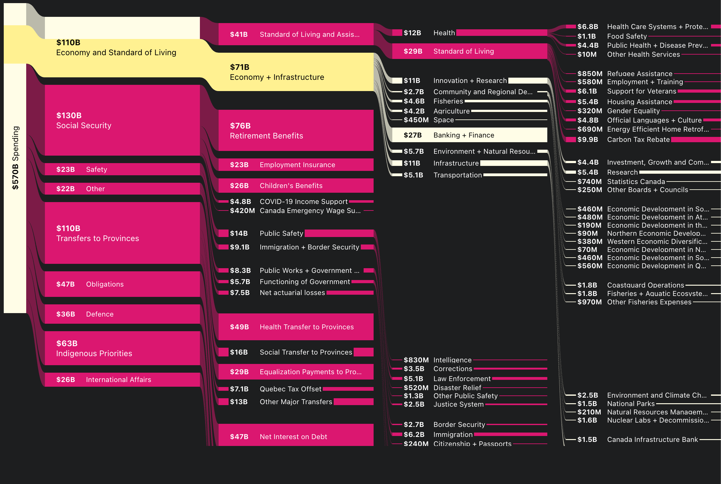
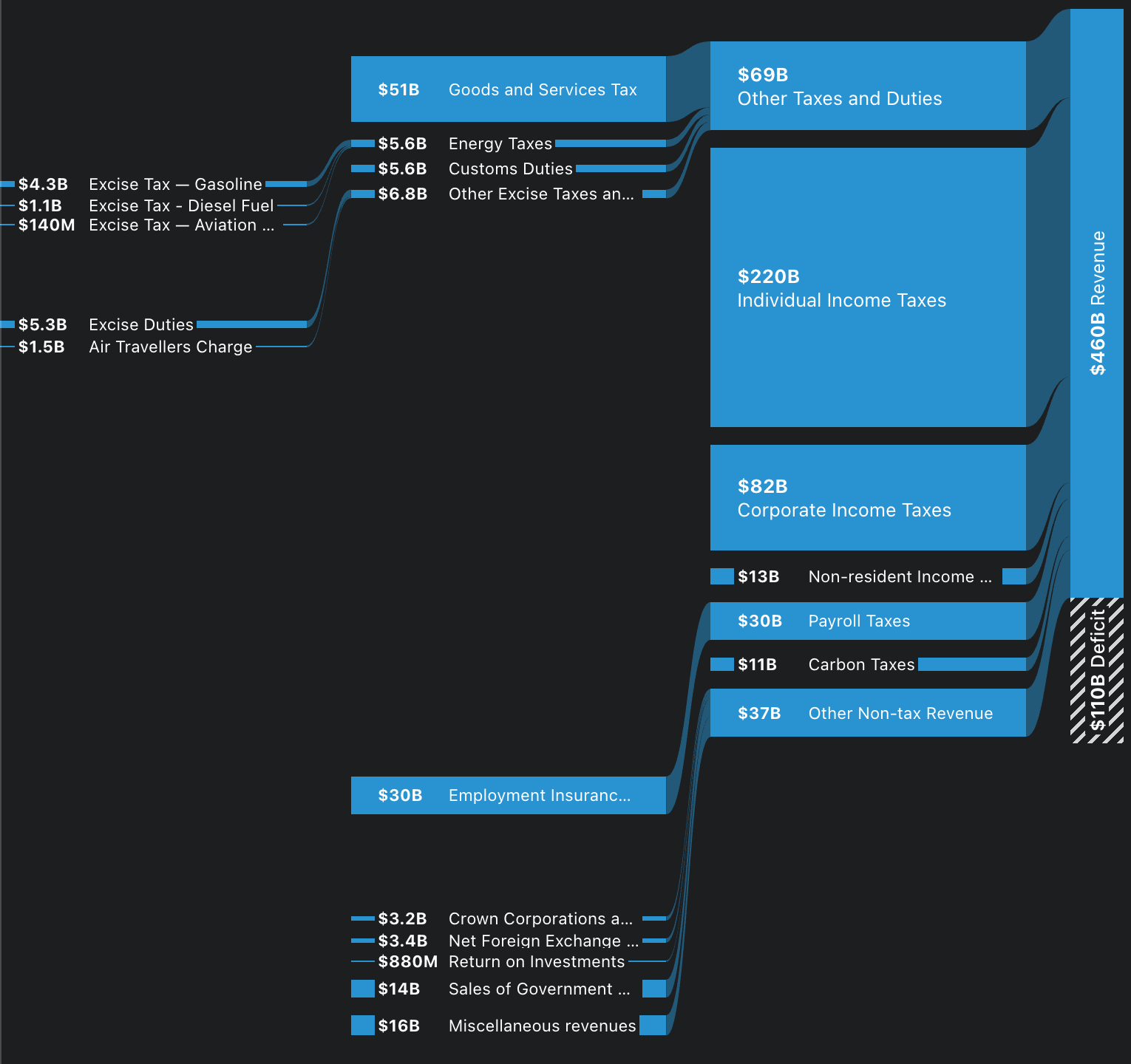
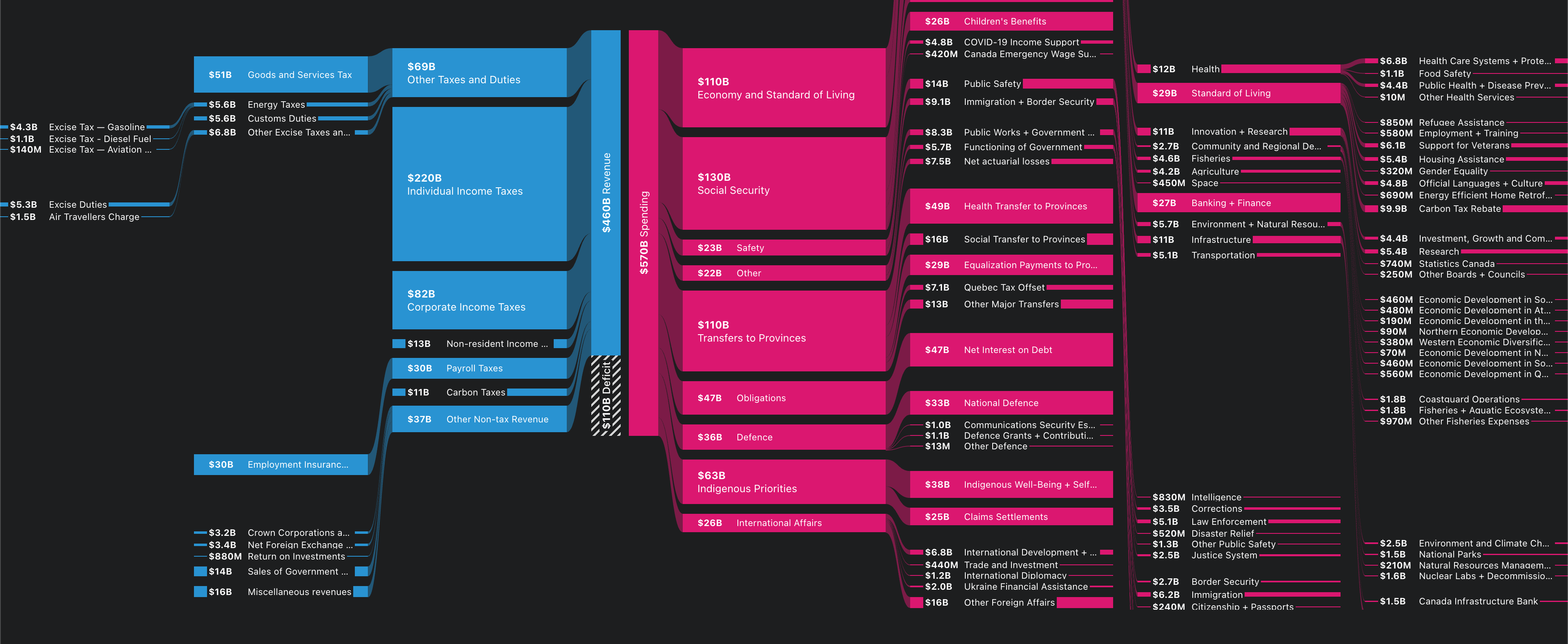
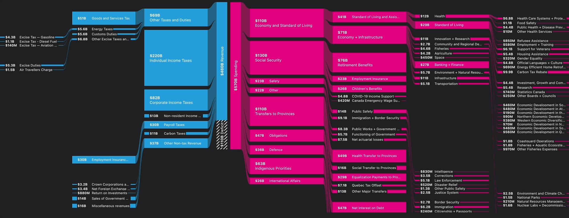
Overview: This interactive Sankey chart clearly illustrates government spending by visualizing the flow of public funds across various sectors. Inspired by USAFacts’ intuitive style, it transforms complex financial data into an accessible and engaging visual format, highlighting relationships between income sources and spending allocations.
Architecture & Implementation:
- Uses flexbox layouts to maintain responsive alignment of data nodes.
- Implements hidden nodes to preserve visual consistency across various scenarios.
- SVG overlays dynamically render interactive links between nodes.
- Real-time coordinate recalculations ensure accuracy during interactions and scrolling.
- Custom SVG path logic handles visually complex alignment scenarios effectively.
Key Features:
- Responsive design for optimal viewing across devices
- Interactive path highlighting on hover
- Auto-scroll feature to reveal hidden nodes
- Supports both left-to-right and right-to-left visualization
Challenging Aspects:
- Precise calculation of coordinates during dynamic interactions
- Performance optimization for responsive and smooth user experiences
- Custom solutions for complex SVG path rendering
Technologies: JavaScript, React, D3.js, SVG, Flexbox
Role: Frontend Developer, Data Visualization Specialist
Design Inspiration: USAFacts