Service Lights
Interactive Service Delivery Visualization
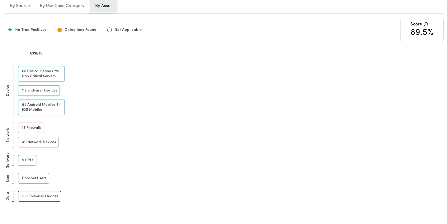
Service Lights: Interactive Service Delivery Visualization
Overview:
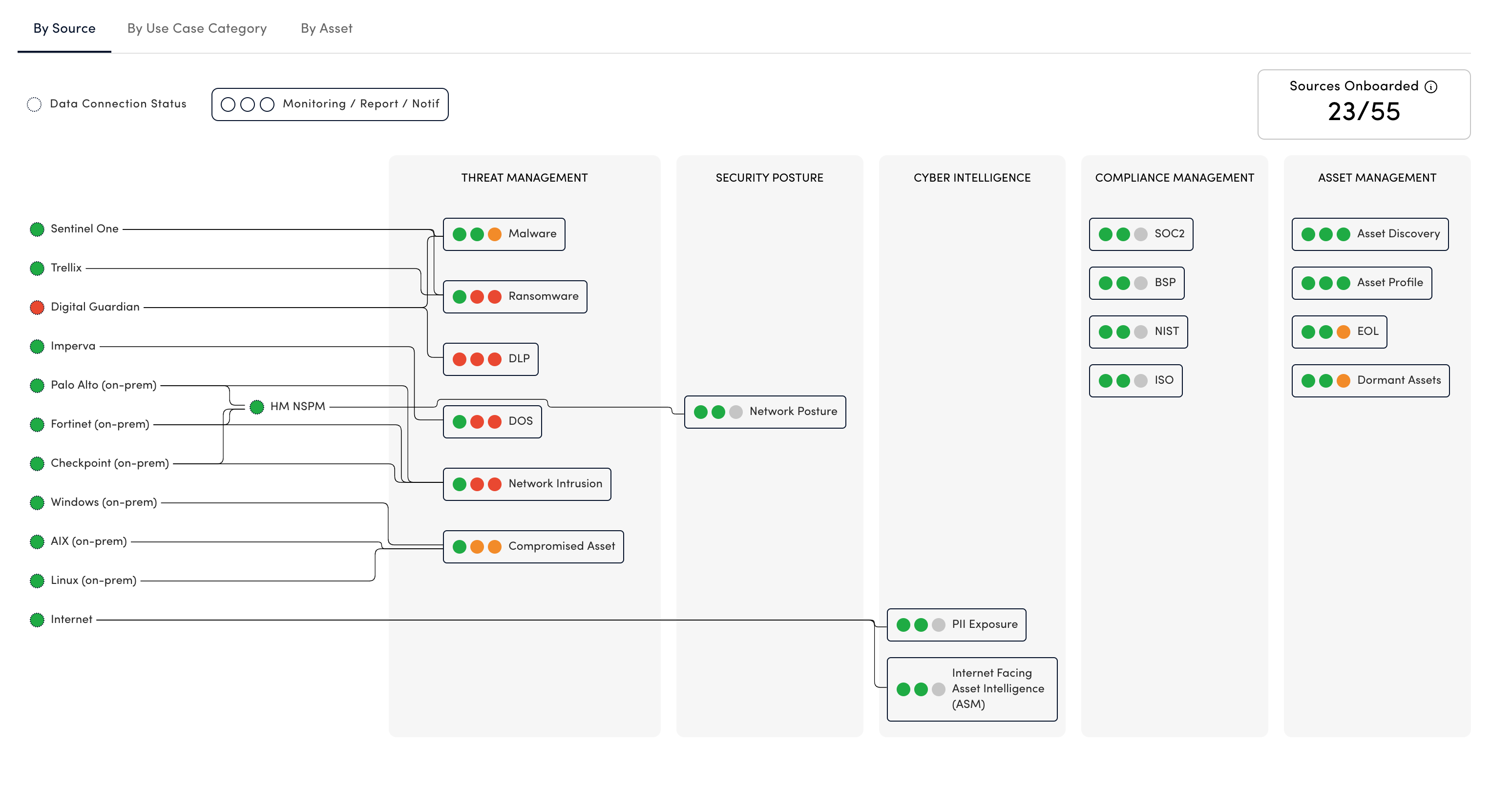
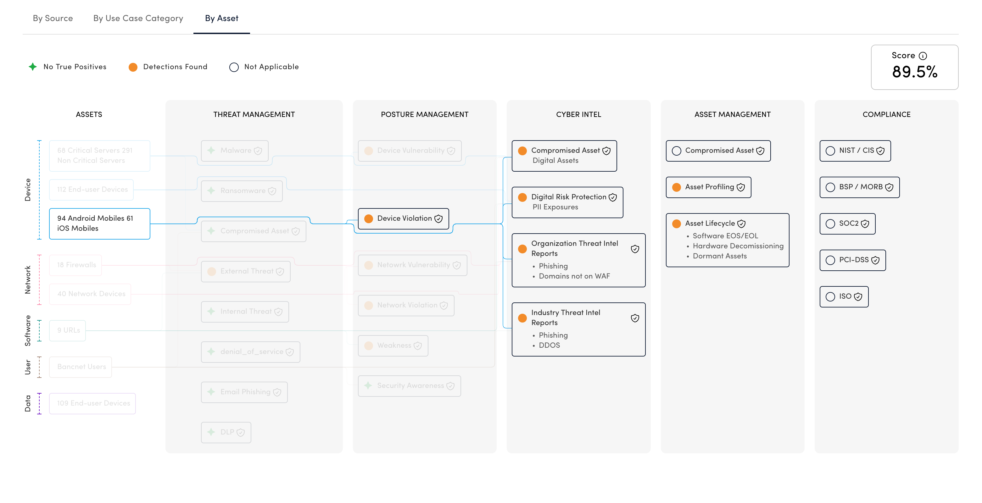
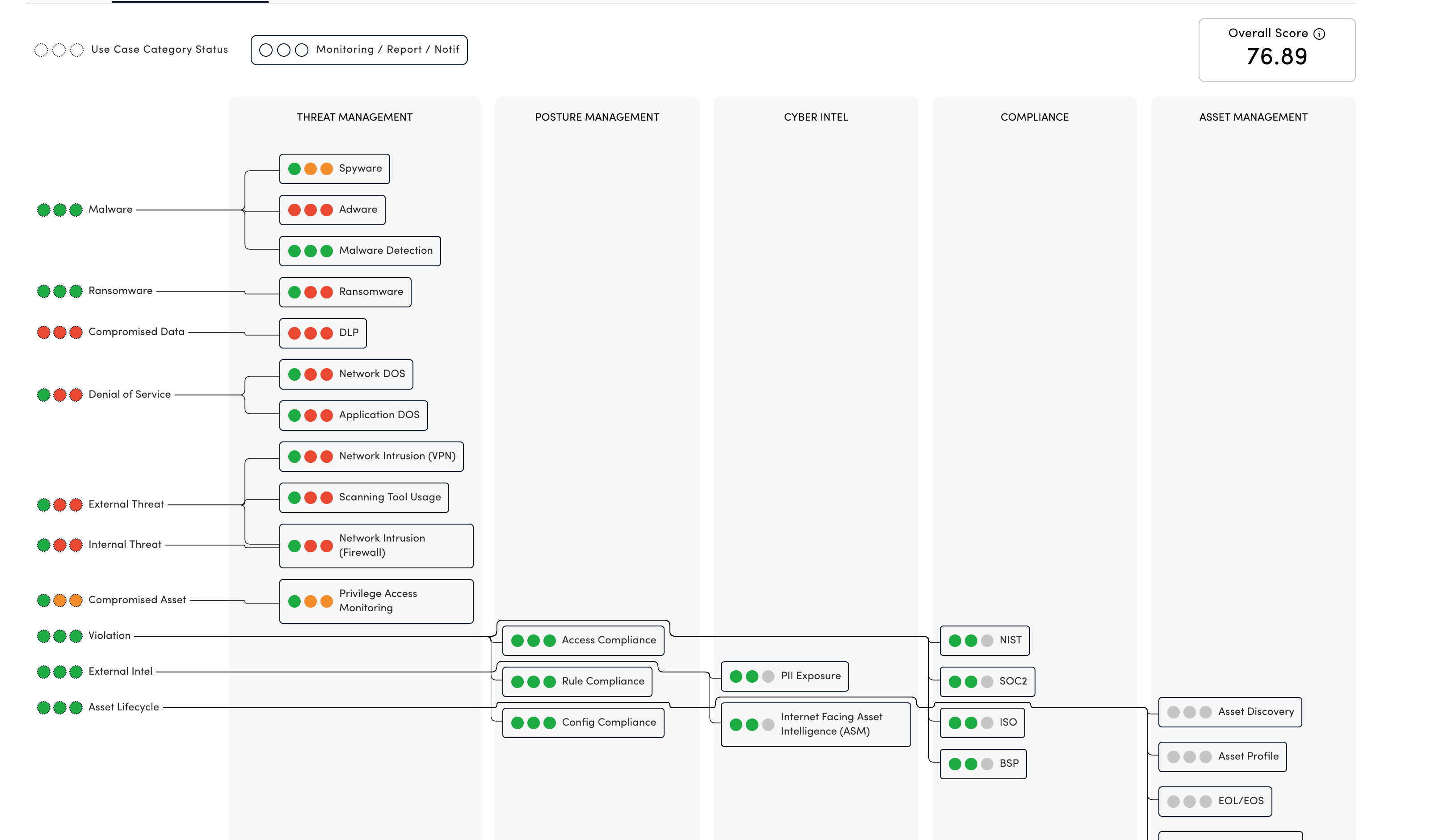
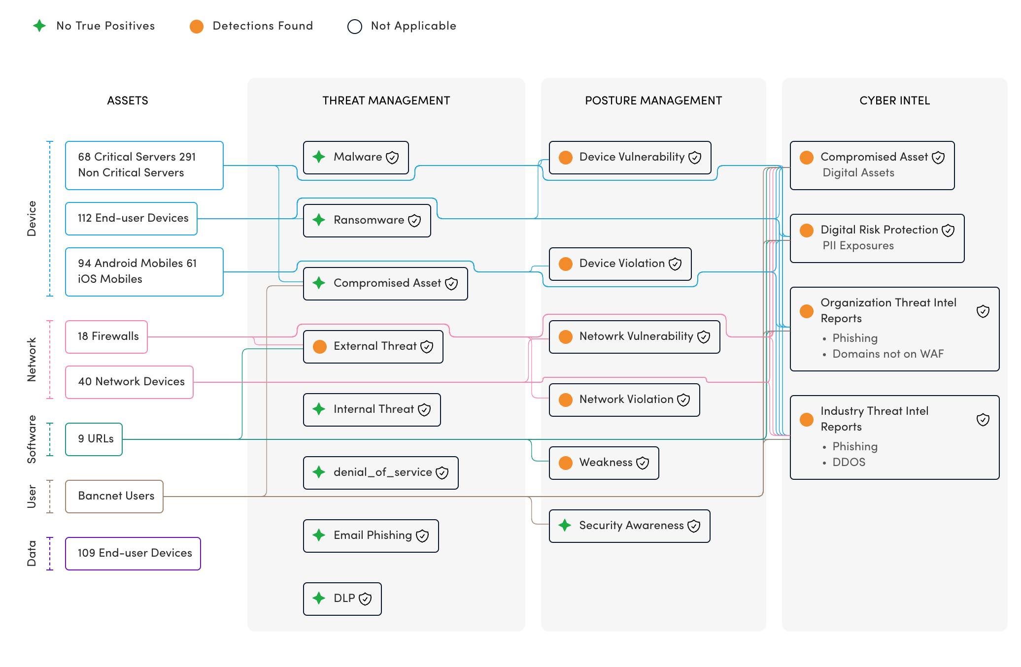
Service Lights is an interactive visualization tool crafted specifically to communicate service delivery reports. Inspired by dendrogram charts, it uniquely captures complex, many-to-many relationships between parent and child service nodes, effectively illustrating complex relationships and statuses within the service delivery process.
Key Features:
Variants:
- Without Grouping:
- Features a clear hierarchy with Parent nodes directly connected to Child nodes.
- Shows real-time service status indicators at each node.
- With Grouping:
- Organizes Parent nodes by categories, displaying grouped service values and statuses.
- Allows intuitive understanding of service statuses across categorized assets.
Component Anatomy:
- Legend: Clearly defines status symbols and colors.
- Parent Column: Includes Parent Nodes and optional Intermediary Parent Nodes, each with labels, statuses, and visual connectors.
- Child Column: Presents detailed Child Nodes, complete with values, statuses, and optional interactive tooltips.
Visual Design & Color Scheme:
- Consistent and accessible design leveraging predefined design tokens.
- Color-coded statuses (Red, Amber, Green, Neutral) to intuitively indicate service health.
- Categorical colors for Parent Groups enhance clarity and readability.
Interactive Elements:
- Hover Interactions:
- Highlights parent-child relationships clearly by reducing the opacity of unrelated nodes.
- Displays contextual tooltips with additional information upon hovering over nodes or statuses.
- Responsive Layout:
- Adapts seamlessly to smaller screens (xs-md breakpoints), allowing horizontal scrolling for enhanced usability.
Animation:
- Columns load sequentially with a smooth dissolve animation, providing a clear visual hierarchy and improved user experience.
Data Structure:
- Robust TypeScript interfaces (ServiceLights, ServiceLightsItem, ServiceLightsStatus, etc.) designed for flexibility, clarity, and scalability.
- Supports intricate data relationships, multiple statuses, and interactive tooltips, facilitating comprehensive backend integration.
Implementation Highlights:
- Straightforward yet visually appealing connector lines optimized to minimize clutter.
- Tooltip mechanisms enhance user engagement by offering detailed insights without overwhelming the visual space.
Challenging Aspects:
- Coordinate Calculations:
- Determining node positions was particularly challenging. For the variant without grouping, children nodes’ Y coordinates are calculated based directly on their parents. Conversely, the grouped mode required calculating positions of the second column first, then aligning parent and child nodes to this intermediate column.
- Special collision-handling logic was developed to avoid visual overlap and ensure clarity.
- Path Drawing:
- Custom modifications to D3’s
stepAfterwere necessary to manage complex connector lines around nodes effectively. - Special logic was developed to optimally position lines side by side, enhancing readability without sacrificing visual appeal.
- Custom modifications to D3’s
Business Value:
- Clearly communicates complex service delivery relationships and statuses.
- Enhances stakeholder understanding through interactive and accessible design.
- Offers scalability and ease of integration for evolving reporting needs.
Technologies: TypeScript, React, D3.js, Figma
Role: UI Developer, Data Visualization Engineer
Design Tools: Figma